|
|
|
|
Projects using Graphic 45 Typography
|
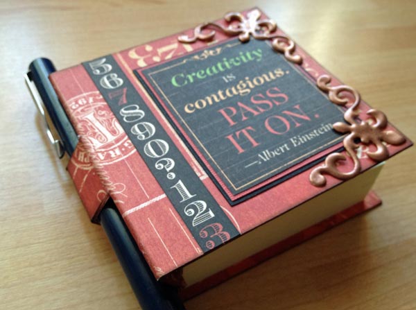
All projects on this page have been designed and created by Design Team member Karen Leahy. Projects include a fabulous variety of scrapbook layouts, a Post-It notes and pen holder, and a double-sided door hanger. All with detailed instructions. Get crafting! |
 |
 |
 |
 |
 |
|
|
 |
 |
  |
|
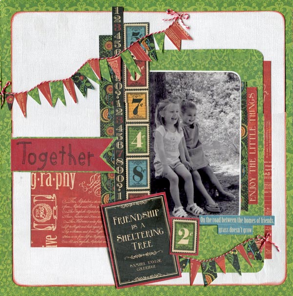
"Together" Scrapbook Layout by Karen Leahy
Step by Step Instruction:
· Cut a 10” square out of the sheet of Graphic 45 Typography Celebrate paper. Put it to one side.
· Cut a piece of white cardstock down to 11”. Round the corners and ink the edges in Fired Brick Distress Ink then mount on the Graphic 45 Typography Celebrate paper giving a ½” border all the way round.
· Use some of the off cut of the green paper to make an oversized mount for the photo. Photo was a standard 6” x 4” photo with rounded corners mounted on white card.
· Use scraps of Graphic 45 Typography Inspire paper under the mount, selecting some words such a ‘enjoy the little things’ carefully.
· Stick the mount and the red scraps down.
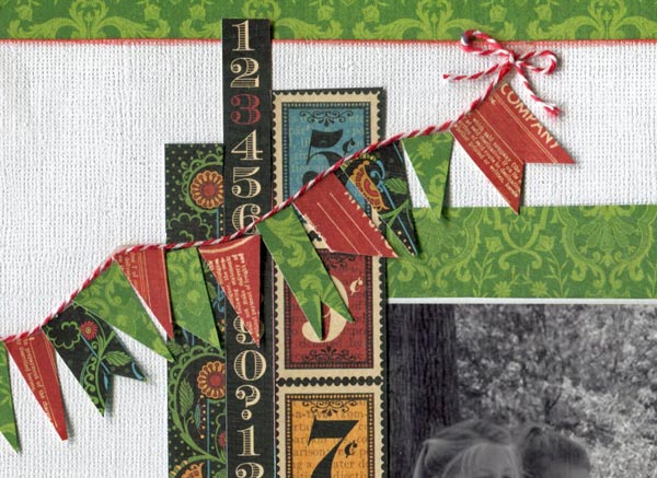
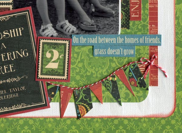
· Add some of the strips from the Graphic 45 Typography Dream paper. (I used two different number strips and I also used a little of the reverse side of the celebrate paper.
· Use double sided tape to stick twine down for the banners top and bottom of the page:
· Cut banners in a variety of shapes and sizes from the scraps of paper left over and add under the twine:
· Finish with a stamped title and the friendship journaling block and phrase.
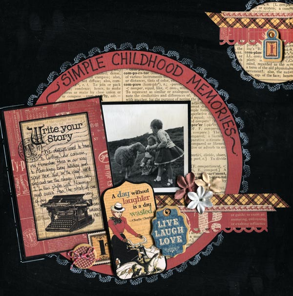
"Childhood Memories" layout by Karen Leahy
Step by Step Instruction:
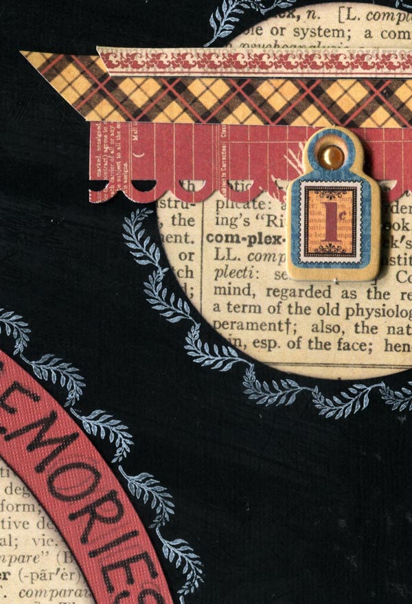
· Cut a circle from the Graphic 45 Typography Journey paper (I am using the reverse type side) and edge in black ink.
· Cut a circle from a contrasting cardstock making it approximately ¾” larger.
· Mount the smaller circle on the larger circle.
· Adhere to the background cardstock
· Use white ink to stamp (alternatively doodle with a white pen) around the circle.
· Use this main circle as the base for the photo and Graphic 45 Typography embellishments
· Build up layers using scraps of paper, photos, journaling blocks (from the Typography journalling papers) and flowers. Button and tags are all from the Graphic 45 Typography chipboard sheets.
· In the top right corner add a circle but make sure it doesn’t all fit. Trim off the over-hang
· Stamp or doodle round the edge
· Add scraps of paper and embellishments to echo the main circle design and finish with a few Prima Flowers.
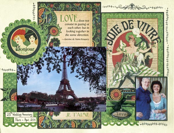
"Joie de Vivre" by Karen Leahy
I love the large Graphic 45 Typography journaling papers which have blocks that which are perfect if you are doing something like Project Life too as they are a standard 4” x 6”. They make great accents and great journaling spaces, but I also love cutting them about a bit and using them as backgrounds on pages too.
For this page I used only a scrap of leftover Graphic 45 Typography paper but used two of the 4” x 6” Graphic 45 Typography blocks as the background to the page.
The love block was cut apart and used both above and below the picture so that it looks like a much longer piece than it is. And after all, what is behind and unseen is just our secret!
The text at the bottom of the Joie de Vivre block was in conflict with the page and bore no relevance to the story I wanted to tell, and so I simple covered it with the picture and the patterned paper overlay.
And the Prima En Francais Vintage Metal Charm was just the perfect accent for the page.
The Bonjour is one of the Graphic 45 Typography stickers, mounted on two die cut circles to tie the colours together.
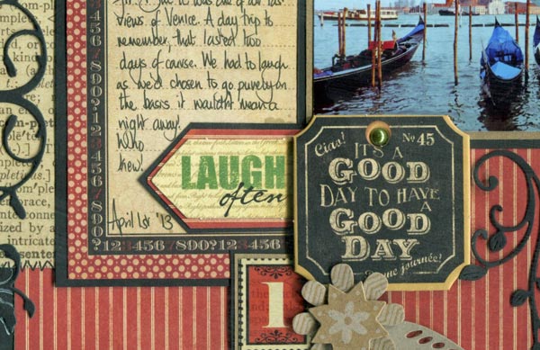
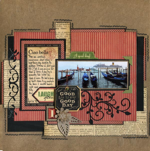
"One Day in Venice" by Karen Leahy
Funny story – we went to Venice for the day … mmmm … there was a pilot issue and our day trip ended up being two days. No luggage, no toiletries, no clean clothes, but a trip to remember!
Step by Step Instructions:
· I love using up Graphic 45 Typography scraps for pages and this page will help you use up yours, with style.
· The Graphic 45 Typography journaling card was the deciding factor for the colour scheme, leading me to go with Kraft, black, cream and red to tie the page together.
· Cut a rectangle 7 ½” x 7” as the base for the mat.
· I used one of the 4” x 6” journal cards, but it was too big for what I wanted so I trimmed it on all four sides and, of course, I kept the bits I trimmed off as I knew they would come in handy.
· Mount the rectangle, with repositionable adhesive, roughly in the centre of the cardstock. It needs to be repositionable as you are going to do a fair bit of lifting up and putting back down as you tuck your scraps in.
· Now comes the fun bit. Select your scraps to coordinate with the page.
· I love using scraps that make it look like a whole sheet has been used. Look at the top and bottom of the large red mat and you will see the off cuts of the spotty red paper that came off the journaling card. By using them top and bottom it gives the impression there is a whole sheet of spotty paper. Just line them up carefully so they match.
· I added scraps of black card and the text paper to the sides and the bottom, again tucking them under the main mat and lining them up if I wanted it to look continuous.
· When I was happy with the scraps I stuck everything down firmly and then added the journaling card and photo.
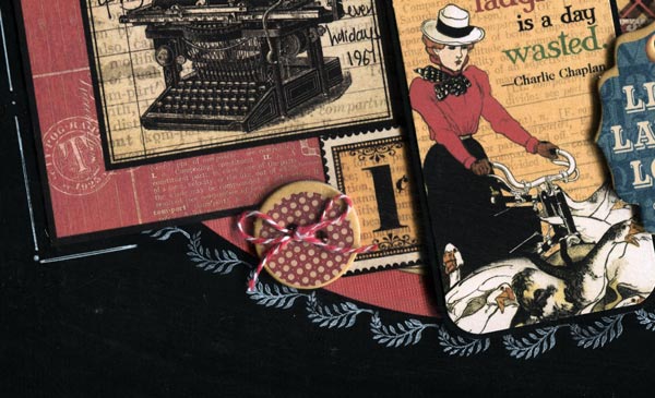
· I wanted a pop of another colour just in a few places and so used some green stickers from the range for the title tab and the photo corners. I added a K & Company Handmade Kraft Floral Layered Accents Flower embellishment and one of the number stickers and then used some of the black card for die cut swirls. "It's a Good day..." is a Graphic 45 Typography chipboard from the chipboard sheets.
· Because there were lots of edges, I decided to use faux stitching on the text paper and then to add stamped lines around the page to unify it.
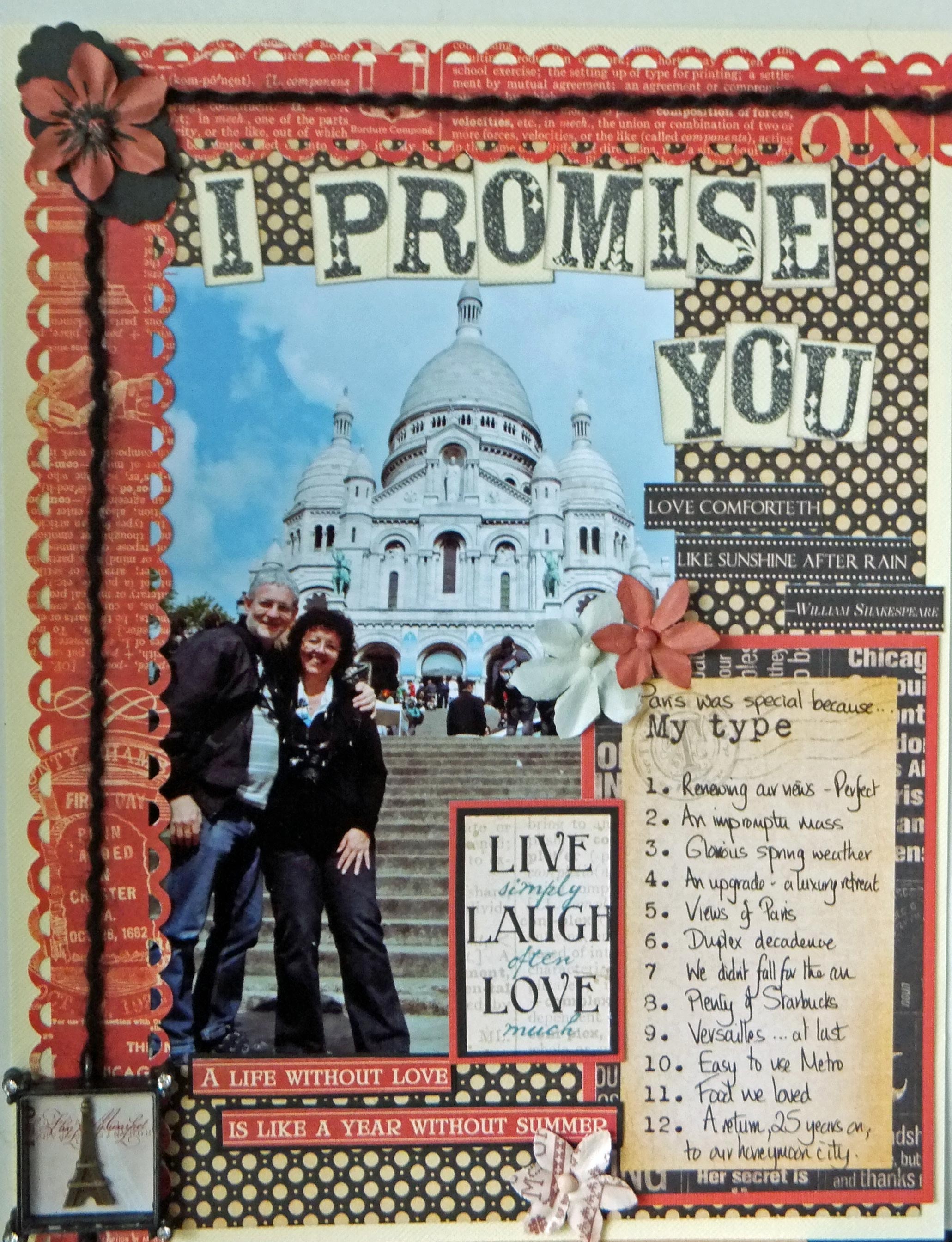
"I Promise You" by Karen Leahy
Sometimes a page evolves because of one element you want to use. In this case I was in love with the gorgeous Prima En Francais Vintage Metal Charm of the Eifel tower. It formed the perfect detail for a page about renewing our vows for our 25th wedding anniversary in Paris.
I used the spotted Graphic 45 Typography paper as the background but because I always feel red is the colour of love I wanted to have the red pops on the page. I added scalloped borders to the top and one side and mounted the cut down journaling block but the borders were too plain so I added black fibres to tie the colours in together.
I like text and this page is certainly text heavy with the journaling block, title and word strips. The full length word strips didn’t work for this page so I cut them into parts. I finished my layout with a few Prima Flowers..
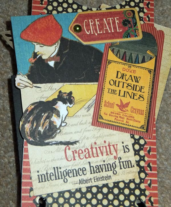
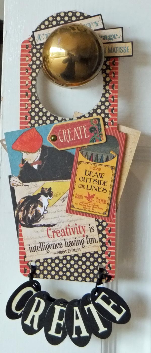
There were so many gorgeous texts about creativity in the Graphic 45 Typography range that I really wanted to make something for the craft room. Both of us work in there and both of us create so a door hanger was perfect. I used a wooden base and covered the two sides with papers from the range. I sanded the edges as this serves to seal them and also to give a distressed look. I added lots of the texts from the Graphic 45 Typography papers and Graphic 45 Typography embellishment packs, trimming some down but making sure they overlapped the edges as I didn’t like the square boxy look. I punched two holes in the bottom with a crop-a-dile ready to hang the letters. As it was a reversible hanger I used an oval shape with the letters in relief on one side and the cut out adhered to the other which worked well. Just remember to spell the word the opposite way when you do the reverse.
Flower is K & Company Handmade Kraft Floral Layered Accents Flower. - everything else is Graphic 45 Typography
Step by Step Instructions
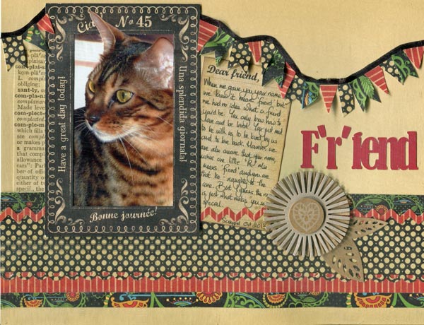
· The 4” x 6” journaling blocks that form part of some of the Graphic 45 Typography sheets also make great frames for photos. I cut the centre panel out of one of these blocks which worked with what I wanted both as a frame and also to use the section I had cut out as a journaling block. Two for the price of one.
· I added blocks of patterned Graphic 45 Typography paper along the bottom. The range is really good as there are a lot of muted colours but then real pops of colour to lift the page too.
· I cut out one of my cats Fiki’s ears (just the photo ear … not the real one!) so that it broke the frame as it just made it look more natural.
· The title was cut on my silhouette and is crucial to the page. Fiki is a friend – indeed one of his names…Rafiki … means friend, but we always say he lost the ‘r’ in his name and is just a fiend.
· I cut lots of banner shapes from the different patterned papers and, using black ribbon and double sided tape, made a banner to go right across the page. Kraft flower is K & Company Handmade Kraft Floral Layered Accents Flower. everything else is Graphic 45 Typography.
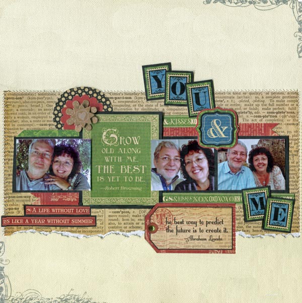
Step by Step Instructions
· Sew a broad strip of paper, in this case the Graphic 45 Typography text paper (reverse side of "Journey"), across the centre of the page. I tore the bottom edge for added texture.
· Make the matting banner from Black cardstock, adding the pictures overlapping the text block
· Add strips of red and green along the top and bottom of the central banner. Again I used some of the Graphic 45 Typography word strips.
· Mount some of theGraphic 45 Typography letter stickers onto green paper from the range and then onto black cardstock. The ampersand was also one of the stickers from the sheet.
· Tuck a couple of contrasting punched circles under the left hand side and add a K & Company Handmade Kraft Floral Layered Accents Flower.
· Add the lettering to the page and also a tag along the bottom edge
· Finish by stamping opposite corners of the page with a border design and grey in.
|
All projects copyright ® Charmed Cards & Crafts. All rights reserved.