|
|
|
|
|

These projects showcases the "Life's Journey" Collection by K & Company
|
All projects on this page have been designed and created by Design Team member Karen Leahy |
 |
 |
 |
|
|
 |
 |
||
|
|
|
 |
|
|
|
 |
||
|
|
|
||
|
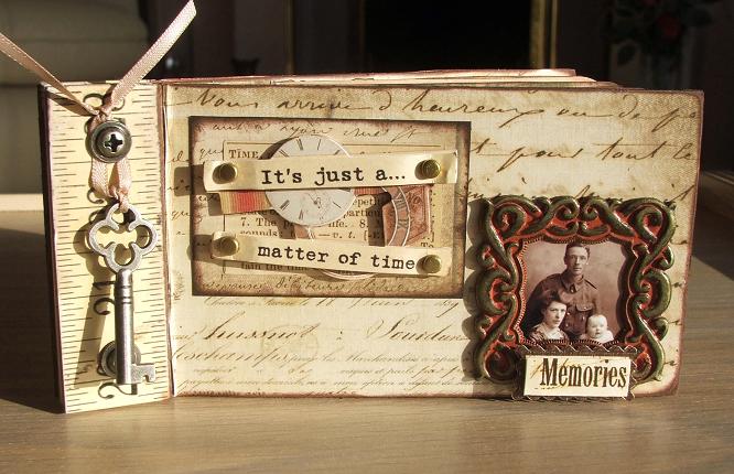
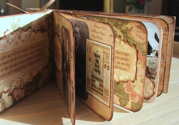
Designed by Karen Leahy |
|
Click on picture to enlarge
|
|
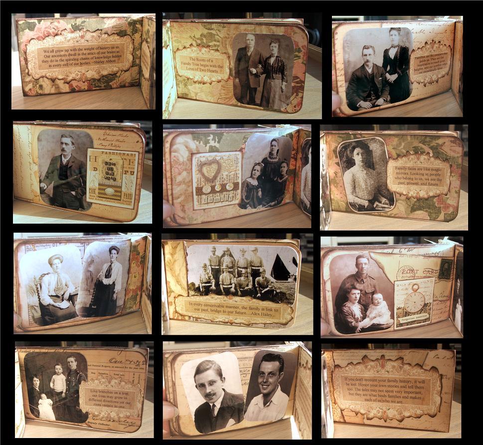
| Products used: K & Company Life's Journey Collection Quick Guide The K and Co Life’s Journey papers were all so gorgeous and they screamed heritage to me. I wanted to make a special heritage mini book for my cousin who has been researching our family tree. I used a Tim Holtz Ruler Book as the basis for the book. One of the nicest things about working with a coordinated range like this is that the work has been done for you and all the colours and tones blend so well together. When you are making a mini book it is also lovely to be able to make things, especially the cover, as lumpy as you want, hence the addition of one of the gorgeous metal frames and one of the grand adhesions stickers on top of that. I used a combination of papers throughout the book as they all worked so well together. Every page was inked to distress it and complete the aged effect. I used the same template for all of the journaling, making it tone in with the papers and printing the different spots on card and adding to the book. The embossed postage stamped papers made great embellishments for many of the pages and adding one of the keys to the outside of the finished book seemed to complete the heritage feel.
|
|
|
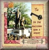
Designed by Karen Leahy |
Click on picture to enlarge
|
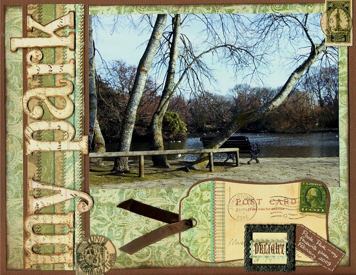
| Products used: K & Company Life's Journey Collection Quick Guide This page was inspired by one of the tags from the Life’s Journey Tag Book. It seemed so apt that, as we send postcards from places we visit, we should also send a scrapbooking postcard from our home town as well. The soft muted greens and creams lend themselves to all sorts of pages, not just heritage work, and they blended well with this photo of the local park. TOP TIP: The chipboard letters were perfect for the title, but they didn’t stand out as much as I wanted. It is really simple to alter them by darkening the edges. Inking them would be tricky with all the inner curves, but using a water colour pencil and a water brush worked a treat to give them that extra bit of definition just on the edges. Adding a couple of the dimensional stamp stickers helped unify the postcard theme and the focus of the metal frame and the word sticker summed up what I was trying to convey on the page.
|
|
|
Designed by Karen Leahy |
Click on picture to enlarge
|
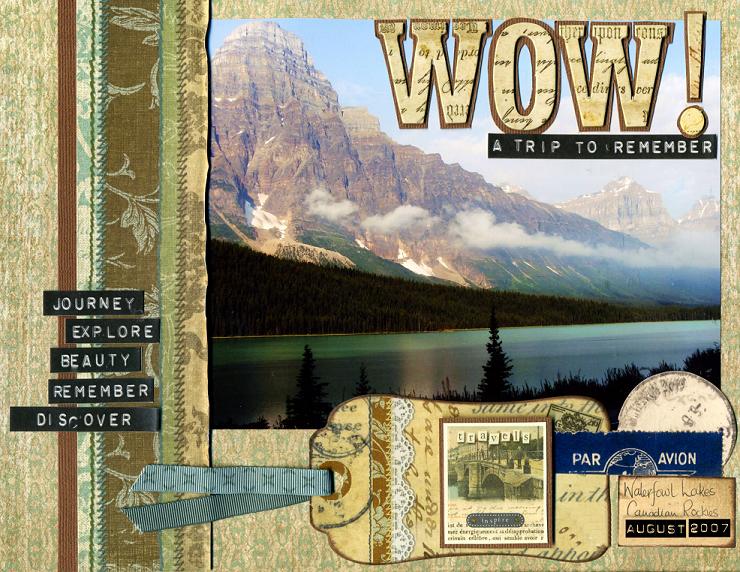
| Products used: K & Company Life's Journey Collection Quick Guide I make a lot of travel pages and life’s Journey, as you would expect, has some great travel words too. I wanted to showcase a great photo by keeping the page simple, but the Life’s Journey papers and letters worked perfectly. I used a strip of the stitched paper down the side as an anchor for the page and a base for the travel words. The chipboard letters made a great title and by mounting them on brown cardstock they literally popped off the page. Adding one of the tags from the tag book and some of the postage stickers just tied the travel theme together.
|
|
|
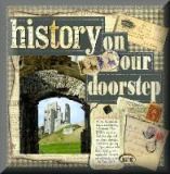
Designed by Karen Leahy |
Click on picture to enlarge
|
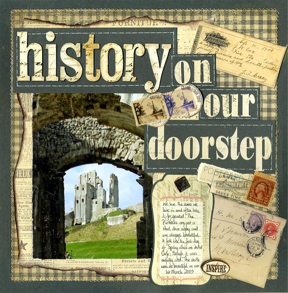
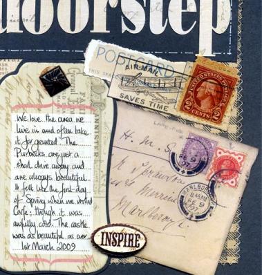
| Products used: K & Company Life's Journey Collection Project Guide Although the papers lend themselves to all sorts of themes, I did want to scrap a heritage page or two. I had taken this picture of Corfe Castle just a couple of days earlier and it seemed a perfect photo to work with with the Life’s Journey papers. The collage sort of effect works well with heritage style pages so I used a variety of backgrounds and embellishments. Having the dark green cardstock as a base around the page and acting as a border helped to anchor the elements on the page and sewing around it added texture. TOP TIP: The white thread was too stark a contrast and so chalking the stitches when I had finished sewing was just enough to soften the colour. I am a great believer in shortcuts and can never be bothered to change the threads in the machine so I always sew with white. It is really simple to then add coloured chalk, rubbed on with a cotton wool ball, to change the colour of the thread. The excess on the cardstock just rubs off easily with a regular good quality eraser, even on white cardstock, and the thread holds the colour. It means you always have the right colour stitching for whatever you are making! The torn papers forming the mount were inked to age them and I also inked all of the ephemera elements from the Life’s Journey pack to tie them in as well. The title was made from the Chipboard letters from the range and from patterned paper cut on a Craft Robo using a similar font. As it is cut from a very similar patterned paper it blends with the main part of the title.
|
|
|
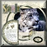
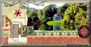
Designed by Karen Leahy |
Click on picture to enlarge
|
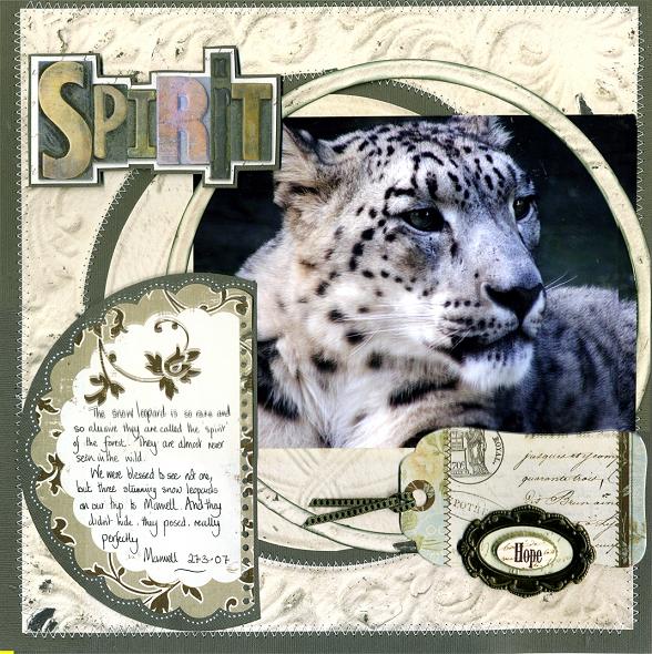
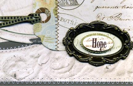
| Products used: K & Company Life's Journey Collection Quick Guide The inspiration for this page came, purely and simply, from the title word ‘Spirit’ in the embossed word set. David Attenborough described the snow leopards as the spirits of the wild as they are so rarely seen, and it stuck. I love using circles on a page and the wonderfully detailed plaster relief paper leant itself perfectly to this. I cute a large rind out of the centre of the paper, leaving a ring shaped hole. I Then mounted the paper onto a dark green background and used the ring I had cut as an offset mount round the photo. Needless to say it was all stitched into place! The circle was echoed in the shape of the journaling block and the metal frame and grand adhesions word added an additional focus to the page.
|
|
|
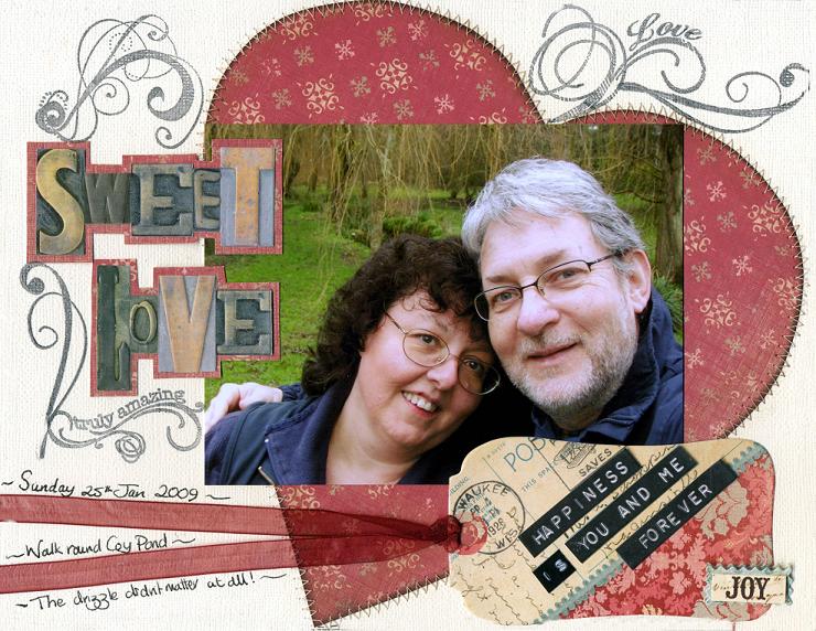
Designed by Karen Leahy |
Click on picture to enlarge
|
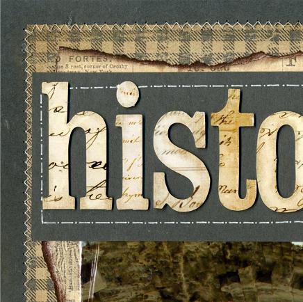
| Products used: K & Company Life's Journey Collection Quick Guide The red papers from the Life’s Journey set were so rich and luxurious I wanted them to be an embellishment in themselves. I cut a large heart from the paper, inked the edges and stitched it on to the page. This was another chance to use the chalking technique as detailed in History on the Doorstep. I sewed with white again but chalked the stitching in a reddy brown colour. The photo was laid over the top of the heart and I used more of the embossed words for the title, mounting them on the red paper to lift them off the page. I added a sub title onto the tag – but I cheated a little. I made the word is on a standard dymo – it blended so well with the stickers and is a great way to make them say exactly what you want. I added a bit of journaling round the organza ribbon and finished the page with some stamping.
|
|
|
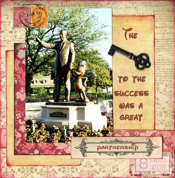
Designed by Karen Leahy |
Click on picture to enlarge
|
| Products used: K & Company Life's Journey Collection Quick Guide I love the keys that K and Co have made and I wanted to use one as part of the title for a page. The photo of Walt and Mickey – a perfect partnership – sprang to mind. The sepia coloured photo mounts are actually the backs of some of the ephemera sheets just inked in burgundy
|
|
|
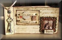
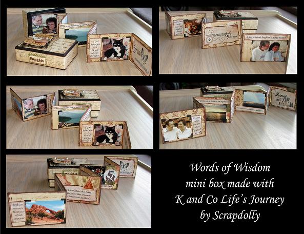
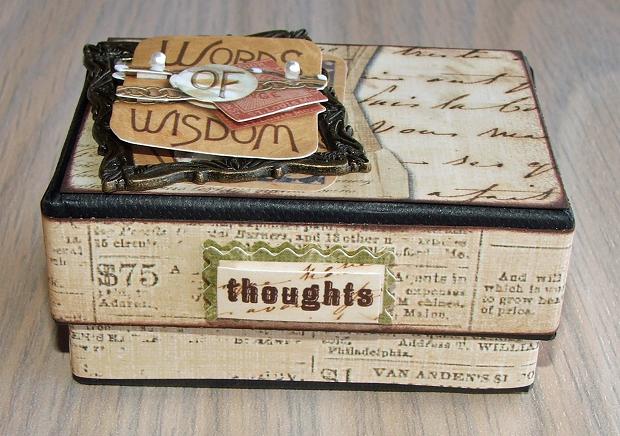
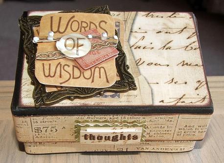
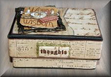
Designed by Karen Leahy |
|
| Products used: K & Company Life's Journey Collection Project Guide The box measures 3 ½ “ x 2 ¼” and is 1 ½” deep. It was already black so made a perfect base and I wanted to leave black edges showing all the way round. I wanted to make the little box filled with inspirational pictures and quotes to stand on my desk. You never know when you will have a bad day and need something inspirational to get things back into focus. I used a lot of my favourite quotes in this one. I cut strips to cover the base and the edge of the lid and inked them before sticking them on. I used strong DS tape for this and to stick the panel on the lid, which was also inked. I wanted the dimensional sticker to be sticking out of the metal frame so I took it apart. Be brave and try it. Peel them apart slowly and carefully. I stuck the base of the sticker onto the lid, added the metal frame and then added the top portion of the sticker. I added a word sticker on the front edge of the lid. I made a folded accordion mini album out of cream card and then covered it in different papers from the Life’s Journey range, inking everything when it was mounted. It was then just a question of printing the quotes and adding them with the photos.
|
|
|
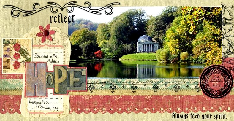
Designed by Karen Leahy |
Click on picture to enlarge
|
| Products used: K & Company Life's Journey Collection Quick Guide The blend of soft reds and greens just worked well with this Autumnal picture. Using a variety of strips and tags gave the page dimension and layers. The scalloped strip was stuck on first, followed by the photo and then the stitched strip with rub-ons over the top. I used circular rub ons for the dare and title and added a sub title across the centre of the tag from the tag book using another of the dimensional stickers. The small square is from the embossed sheet of stamp designs and the tag is secured with a punched flower from the same soft red paper and a brad.
|
|
|
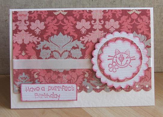
Designed by Karen Leahy |
Products used: K & Company Life's Journey Collection The background paper, cut smaller than the card was run through a scallop punch and a simple stamped image was mounted on different sized circles. A strip of grosgrain ribbon added a little texture.
|
|
|
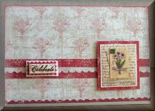
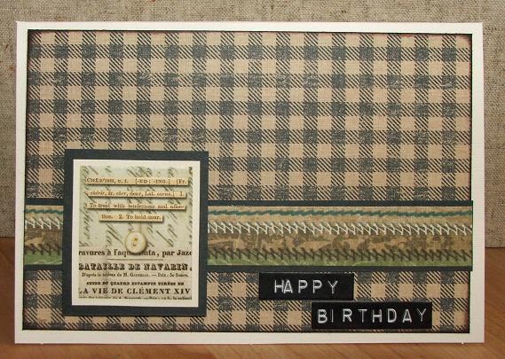
Designed by Karen Leahy |
Products used: K & Company Life's Journey Collection Quick Guide I always struggle with cards for male family members and friends but the Life’s Journey papers were perfect. This one uses the chequered background which, as well as being quite masculine also has a country feel. I added a strip of the stitched papers and a sentiment cut from the embossed stamp papers which I mounted and raised on foam pads. The Life's Journey dymo strip stickers made a perfect sentiment at the bottom.
|
|
|
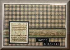
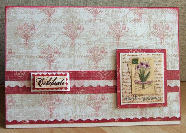
Designed by Karen Leahy |
|
| Products used: K & Company Life's Journey Collection Quick Guide I used two different papers from the range and the beauty of working with a coordinated range is that you know everything is going to go well together. Using a scallop edged blade made a softer edge and again I use one of the embossed stamp images from the embossed sheet as a decorative embellishment for the card. The grand adhesion sticker made a perfect understated sentiment accent.
|
|
|
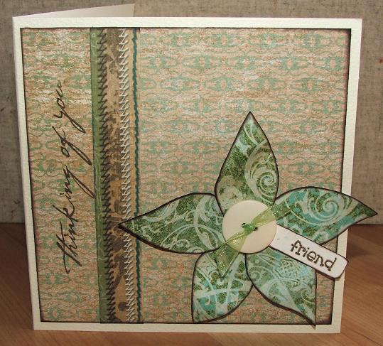
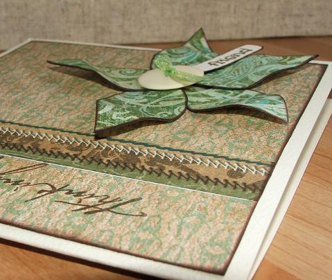
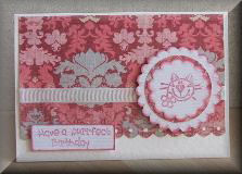
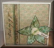
Designed by Karen Leahy |
Click on main picture to enlarge
|
| Products used: K & Company Life's Journey Collection Quick Guide I used a square of one of the soft green papers as a base for the card, adding another strip of the stitched paper. The sentiment was stamped to one side of this strip. The flower was made by sticking the contrasting green paper to some cardstock and then cutting out petal shapes. The shaped were inked and then mounted on the card. I added a small tag stamped with the word friend before fixing a button with an organza bow into the centre of the flower. Mounting the petals on card meant they were a bit more substantial and you could bend them into all sorts of shapes.
|
|
All projects copyright ® Charmed Cards & Crafts. All rights reserved.